Categories
CRA Research Economic Indicators Latest Updates News Slider

Regional Economic Indicators

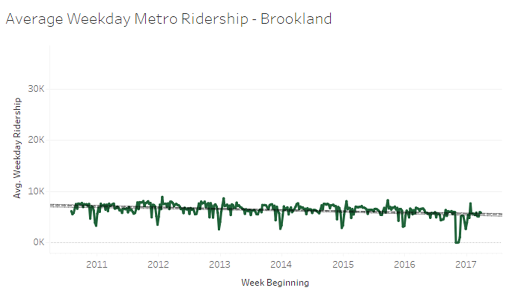
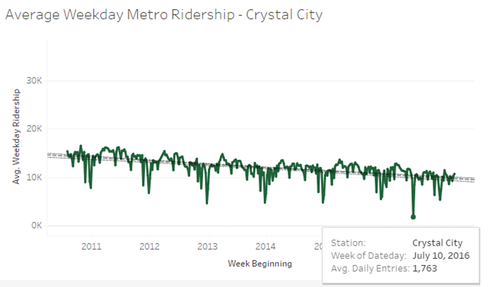
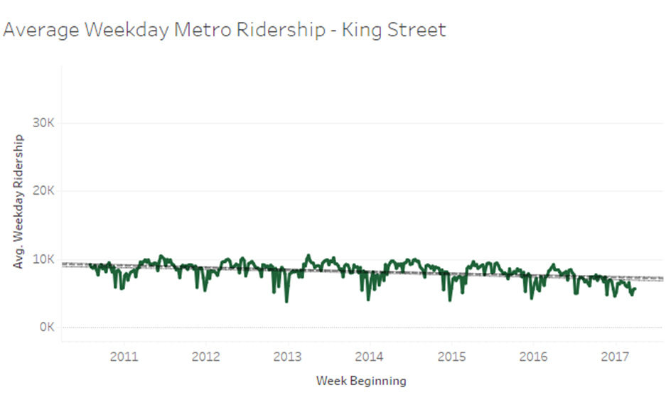
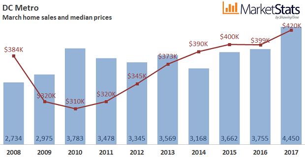
The Center for Regional Analysis routinely updates data that provide a greater understanding of what drives the Greater Washington regional economy.

View the current set of indicator data charts here 

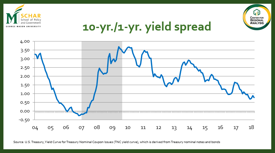
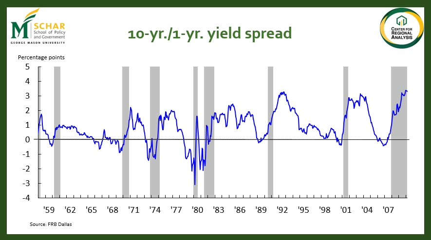
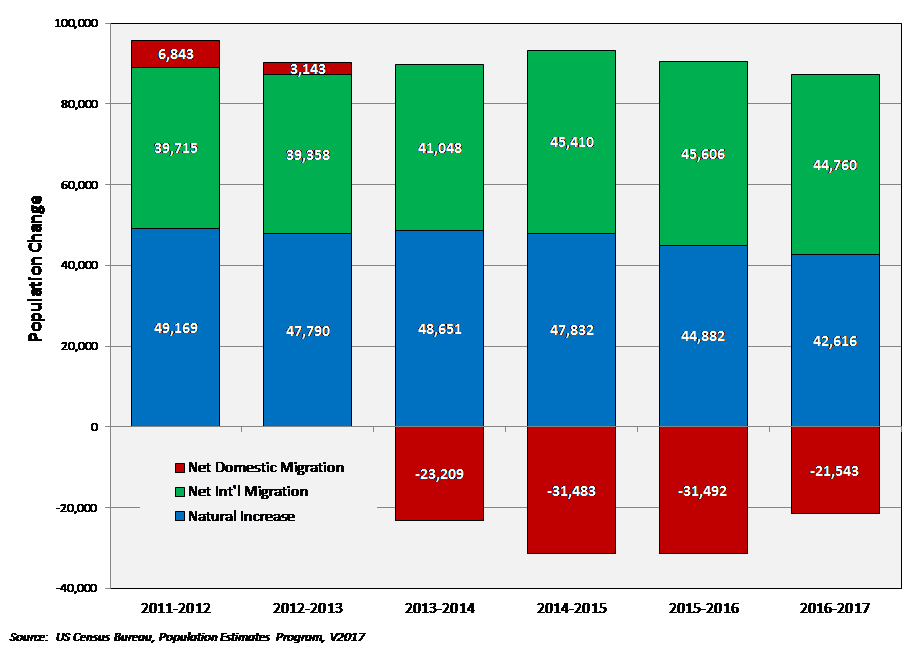
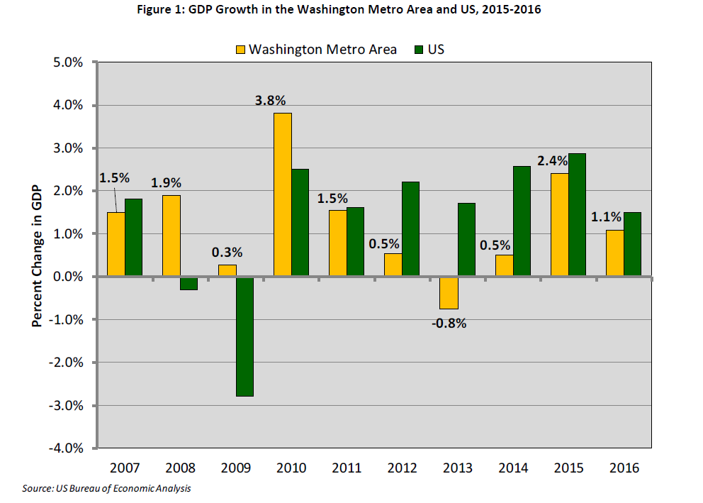
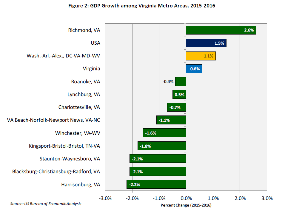
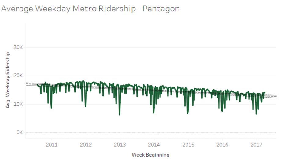
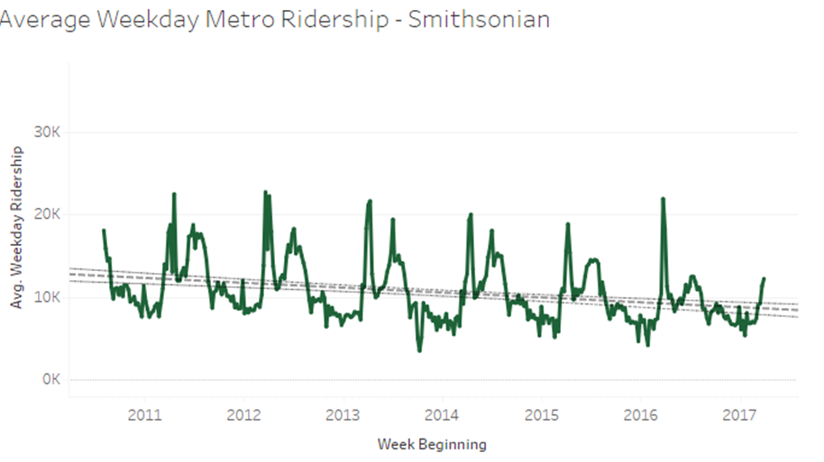
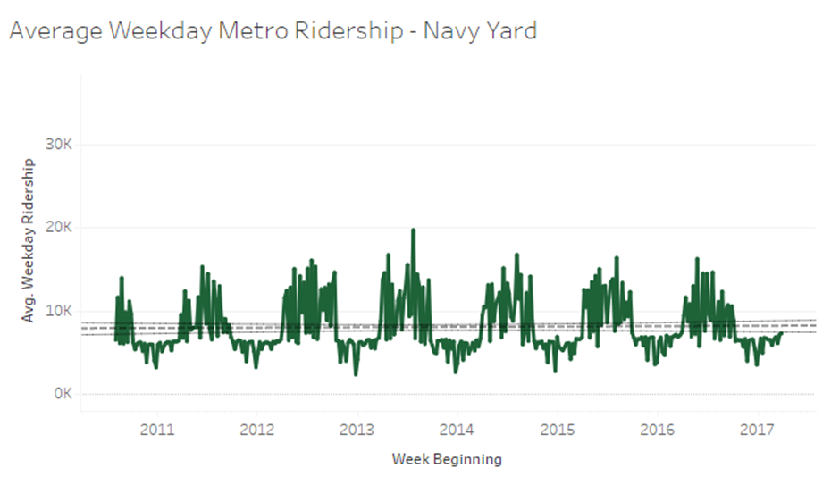
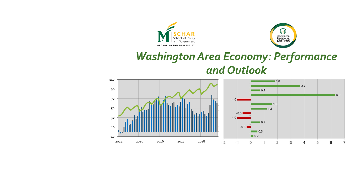
CRA produces more than 60 charts and graphs summarizing trends in the national and regional economies and housing markets.  Data elements include gross domestic product, jobs, unemployment, consumer confidence, coincident and leading indices, interest rates, sales of existing and new homes, home prices, and regional economic forecasts, among many other categories. CRA develops information concerning both the overall regional economy and focused/select economic and housing data for Northern Virginia, Suburban Maryland, and the District. This set of charts is updated when new data are released.

Categories
Economic Indicators Latest Updates Uncategorized

Inverted Yield Curves and an Impending Recession

Recently the financial press has had several stories talking about interest rate spreads and inverted yield curves with whispers of the word “recession”. But what exactly is an inverted yield curve and what predictive role does it play in the U.S. economy?

The yield curve is the difference in short-term rates like a three-month or 1-year Treasury note and long-term interest rates like on 10 year Treasury bonds. Short-term interest rates paid on Treasury notes are usually lower than interest paid on long-term bonds. If short-term rates are higher than long-term rates, the yield curve is upside down, or inverted. Over the past several months, the difference in the short term and long term rates have become very small, and there is concern the yield curve will invert (see chart below).

There are many factors that affect government bond rates including stock prices (an alternative investment to bonds), currency exchange rates (international investors), policy actions by the Federal Reserve Bank and other central banks in Europe, China and elsewhere, government deficits/debt levels, and other factors. For this discussion, we will focus on perceptions of risk and uncertainty about future U.S. economic performance. When investors view the outlook for the US economy as uncertain (higher levels of risk), they will expect to earn higher interest rates on government notes and bonds. From this perspective, when short-term rates are higher than long-term rates, investors are saying they are less certain about the economy next year versus ten years from now. That’s extraordinary. Imagine trying to make business decisions in the next 12 months versus 10 years from now and being less certain about next year than far into the future.

Since 1959 the yield curve has inverted 8 times. For 7 of those times the US economy went into recession within a few months. The figure below shows the spread between 10-year Treasury Bonds and 1-year Treasury Notes. The grey bands indicate recessions in the U.S. economy. Some financial experts see an inverted yield curve as almost a sure sign of an impending recession.

So, are we headed to a recession? After all, even though economic growth since the end of the Great Recession has been relatively slow, the current growth cycle is long-in-the-tooth. In historic terms, we are overdue for a recession. Fortunately, we see the very small yield spread as an artifact of other market factors. Short-term interest rates are increasing in large part because the Federal Reserve Bank is raising its rates to more market-normal levels. On the other end, the economy is doing better and more money is flowing into pension funds, foundations, and other institutional investors. These institutional investors are buying more long-term bonds, which means that interest rates paid on these financial instruments is being held down, which narrows the spread. Still, if we do experience an inverted yield curve over the next several months, expect some market players to “freak out,” at least temporarily.

Many realtor clients in Northern Virginia are highly attuned to market data such as interest rate spreads. If your clients show signs of “freaking out,” we suggest telling them to consult their financial advisors and to consider that the fundamentals of the U.S. economy are still strong. With interest rates still low and a very solid job market, this remains an excellent time to be in the housing market.

Categories
CRA Research Economic Indicators Latest Updates News

DC Region Population Estimates and Components, 2016 – 2017

The US Census Bureau released the 2017 Population County and Metro/Micro Area Population Estimates. Between 2016 and 2017, the Washington-Arlington-Alexandria, DC-VA-MD-WV Metropolitan Statistical Area (Hence forth, the Washington Metro Area), increased its population by 65,908 between July 1, 2016 and July 1, 2017.1 This represents an increase of 1.1 percent, and continues the trend of relatively stable regional population growth; the region grew 1.0 percent between 2014 and 2015, and 1.0 percent between 2015 and 2016.

Read the full report here

Figure 1 shows that the region declined in two of the three components of population change. The region had less natural increase and less international migration between 2016 and 2017, than it did between 2015 and 2016. Perhaps most noteworthy for the region is the continued net domestic outmigration for the fourth consecutive year. Although not as large as in previous years, over 21,000 more domestic migrants left the Washington Metro Area than moved to the area.

Categories
Economic Indicators Latest Updates Presentations

26th Annual NOVA Chamber Economic Conference

Dr. Terry Clower spoke about the United States Economic Outlook for 2018 at the 26th Annual Northern Virginia Chamber of Commerce Economic Conference on Thursday, January 18th. The event was held at the Fairview Park Marriott in Falls Church, VA.

View the Presentation here

Categories
Economic Indicators Latest Updates News

2016 GDP Growth in the Washington DC Metropolitan Area and Commonwealth of Virginia

The Washington DC Metropolitan Area Continues to Show Lackluster Economic Growth

The US Bureau of Economic Analysis released data on 2016 Gross Domestic Product by Metropolitan Area. In 2016, the Washington-Arlington-Alexandria, DC-VA-MD-WV Metropolitan Statistical Area (Hence forth, the Washington Metro Area) had a $449.3 billion economy. This represents an increase of 1.1 percent over the revised 2015 figure of $444.4 billion.[1] Between 2015 and 2016, the Washington Metro Area GDP grew slower than the national rate of 1.5 percent but faster than the Commonwealth of Virginia which grew 0.6 percent.

This is the third consecutive year of regional economic growth. The GDP increase was led by growth in the Professional and Business Services sector – contributing 0.55 percentage points of the 1.1 percent increase in Washington Metro Area GDP. The finance, insurance, real estate, rental, and leasing sector had declining contributions to area GDP – reducing growth in area GDP by 0.15 percentage points.

Figure 2 shows that among the ten Metro Areas in Virginia, the Washington Metro Area is one of two that showed growth in GDP between 2015 and 2016. Richmond experienced the largest GDP growth at 2.6 percent, and was the only Virginia metro area to have consistently positive economic growth over the past five years. The metros along the I-81 Corridor, Staunton-Waynesboro, Blacksburg-Christiansburg-Radford, and Harrisonburg, saw the largest declines in GDP at -2.1 percent, -2.1 percent, and -2.2 percent respectively between 2015 and 2016. All three metros had positive economic growth of nearly 3 percent between 2014 and 2015.

[1] The 2015 Washington Metro Area GDP was upwardly revised from 442.4 billion, moving from 1.3 percent growth between 2014-2015 to 2.4 percent growth over the same period in the revised estimate.

Categories
CRA Research Economic Indicators Latest Updates

Metro Ridership Viewer

Public transportation viability and accessibility are vital to the regional economy, especially in the Washington Region where we currently hold the second longest commute time in the nation.  The Washington Metropolitan Area Transit Authority is facing several challenges due to funding, administration, and performance issues, especially with its Metrorail system. As the system continues in a period of line closures (safe-tracking), rate hikes, and funding issues, we at CRA are keeping a close eye on Metro related data as a key economic indicator of the region. As a part of this, we have released an interactive Metrorail ridership viewer on our website which breaks down weekday ridership by station. The data currently includes ridership numbers from 2010 through 2017 Quarter 1 and will be updated quarterly into the future.

Click here to Explore the Data  

Each data point indicates the average Monday through Friday daily ridership on the week beginning with the date listed. With a decrease across all stations of nearly 16%,  80 out of 92 stations have decreased in weekday ridership from 2011 through 2016. Stations on the ends of the orange line have decreased the most including West Falls Church (-73%), Vienna (-41%), Landover (-38%), Dunn Loring (-34%), Deanwood (-34%),  and  New Carrolton (-31%). Many park and ride stations have decreased in ridership significantly as well, including Franconia-Springfield (-34%), Huntington (-23%), and Shady Grove (-19%). Among the few stations showing increased ridership, the NoMa-Galluadet Station (New York Ave) ridership increased nearly 15% along with a 6% increase at Navy Yard (6%).

Each station tells a unique story and many real-time phenomena are displayed in the ridership data. A few insights are shown below. Please share any additional unique findings or insights on our twitter page @GMU_CRA or by email to sshanhol@gmu.edu

  • Many stations cater primarily to workforce commuters. The Pentagon Station –  being a big bus to rail transfer point with many federal/nonfederal workers and contractors – displays predictable dips during holidays. Most stations show significant dropoffs during the weeks of Thanksgiving and the Holidays.
  • Cherry Blossom season is one of the most popular times for locals and tourists alike to visit DC. The Smithsonian station, among others, drastically spikes during the week of the Cherry Blossom festival and again in mid-summer. 
  • The Navy Yard station is located near Nats Park and we can visually see the effects of baseball season on ridership there. 
  • Service on Phase I of the Silver Line opened on July 26, 2014 between Wiehle – Reston East and Largo Town Center, with five new stations being added to the existing network west of East Falls Church. The effects of this opening are seen by comparing the new station of Whiele to the West falls Church station (just before the silver line meets and joins the Orange). West falls church drops dramtically in late July as Whiele comes on line. The second phase of the silver line out to Ashburn and Dulles is anticipated to open in 2018, and it will be interesting to see its effects.  

  • SafeTrack is an accelerated track work plan to address safety recommendations and rehabilitate the Metrorail system to improve safety and reliability. The program has been implementing intermittent line segment single tracking and shutdowns since early June 2016 and is expected to end in June 2017. Its effects can be visualised by matching the scheduled surges to specific stations. It will be crucial to analyze the effects of SafeTrack after its completion, specifically whether ridership returns to pre-maintenance levels.
    • Single tracking between Vienna and West Falls church causes a dip late 2016 in Vienna ridership (also accounted for in the corresponding spike at West Falls Church above). 
    • Ballston ridership sags in mid-2016 due to single tracking.
    • Brookland ridership goes to zero as a segment of the red line is shut down in November 2016. 
    • Crystal City sinks as the blue line closed between Pentagon City and National Airport in mid-July 2016
    • King Street station is down to Holiday ridership numbers in March 2017 due to single tracking.  

Please share any unique findings or insights on our twitter page @GMU_CRA or by email to sshanhol@gmu.edu

Categories
Economic Indicators Latest Updates News

March Regional Housing Update – Price Gains and Increased Sales

The housing market in the Washington metro area continues to tighten as median sales price is highest March level of the decade, sales and pending sales are at decade highs, and inventory levels decline for the eleventh month in a row

  • March 2017’s median sales price of $420,00 was up 5.3% or $21,000 compared to last year. This is the highest March median sales price of the last decade, easily topping the prior high of $400,000 seen in 2015.
  • Sales volume across the DC Metro area was nearly $2.3 billion, up 26.7% from last March.
  • Closed sales of 4,450 were up 18.5% compared to last year. It was also the highest March level in a decade and easily exceeding the 3,755 sales recorded last March.
  • New contract activity of 6,254 also reached a ten-year March high, increasing by 1.4% over last year.  New listings of 8,210 were down 1.7% compared to last year.
  • Active listings of 8,648 are down 11.5% compared to last year but up 15.3% compared to last month. This is the eleventh consecutive month of declines in year-over-year inventory levels, and inventories are at the lowest March level since 2014.
  • The average percent of original list price received at sale in March was 97.9%, up from last year’s 97.1%, and also up from last month’s 97.4%.
  • The median days-on-market for March 2017 was 15 days, 12 days lower than last year.

Read More Here

This analysis of the Washington, D.C. Metro Area housing market was prepared by Elliot Eisenberg, Ph.D. of MarketStats by ShowingTime and is based on March 2017 MRIS housing data.